OPTION ONE
This image is very casual compared to the look of the artist in the other texts. Her position in the image is very laid back. She is leaning against a wall and is looking very calm. However, her eye contact with the camera makes her look more confident and keeps the strong image that has been created for her throughout the other texts. The artist is wearing a bohemian style outfit which shows her as laid back and summery as the outfit conotates summer with the straw hat and vest. We thought that by changing the look of our artist slightly by going with her more casual side which we briefly see in the music video would help is gain a larger target audience and appeal to more. A filter has been placed on the image. It is a sepia filter which shows the image in a vintage tinted colour. It makes the photo more relaxed and brighter than the original photograph which had harsh lighting and shadows. The vintage look has connotations to the past which links with the flash backs in our music video. This poster is very experimental with text and uses it in cooperation with the positioning of the artist in the image. The vertical font ‘You You You’ is very bold and the dark colour highlights the text against the sepia background. Jessica Drake is written in the same bold font . Both of these have pink tints on the writing. The colour is not really strong but just adds a hint of colour to the otherwise plain image. Also on the wall behind her we have placed her name over and over again as if it is written behind her. This is in a dark beige colour so it fits in with the filter on the image. This image is really nice however; we think the font maybe too complex for a poster.
OPTION TWO
This poster is landscape which immediately seems different from other mainstream artist posters as it is challenging a convention. We used a multi-split screen effect as we did in our music video for this poster. This creates a synergy between the structures. However, in the poster the artist looks vulnerable and shy which is very different from the confident woman we see in the music video. The picture seem as if she is shielding herself from something. This could open up to a larger audience as it shows another side to the audience that may appeal more. The image is very bright and well lit however, you can see her shadows on the wall which doesn’t look very professional compared to other posters which do not show the shadows. But, i do like the imperfection in the background as it looks rustic and old fashioned. The font is the same font that is used in the digipak so is creating an immediate synergy between the two. The outfit however, is very different from what we see in the other texts as it is a lot more casual. The font is positioned around the edges of the poster and then where the images join. I think this makes the poster a little crowded and is a little to complex once again for a poster.
OPTION THREE
This poster is in greyscale which immendiately has a link with our music video as that include a similar black and white effect as we see here. The colour of the font is also a link to both the music video and digipak as it is the same magenta colour that is seen throughout. The outfit is very bohemian like and show her as casual which we see a small bit of during the music video. However, it opens up the demography a little more to a wider audience that may be attracted to this. The pose she is striking channels vunerability and secrecy as she is not looking towards the camera and her head is positioned down. However, the rest of her body is facing the front which still shows her confidence. This is similar to on the digipak where some images show confidence and some vunerability. The image suggest summer with the outdoor location and the casual outfit however, the scalf around her could symbolise the coldness she feels and this could be echoed the the greyscale effect also. This image is not to crowed as the position of the artist and the text is good and not to cramped.
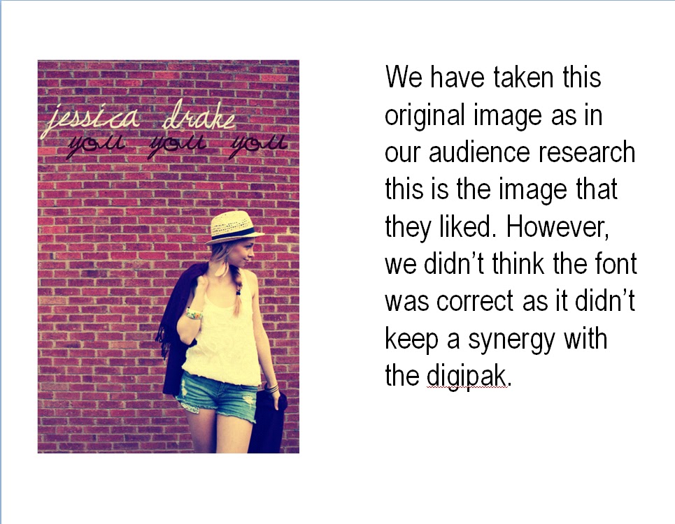
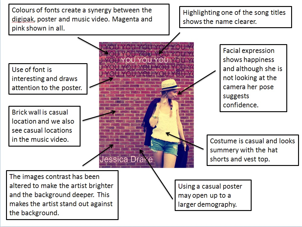
OPTION FOUR
This poster has a very girly and warm feeling to it unlike some of the others. The image sticks to conventions of posters as you can see almost a full body shot of the artist. However, she is not looking as the camera as artists do such as Adele and Katy Perry. Also, the pose is very casual unlike other posters. The brick wall background seems rustic and casual which does not really fit with our music video and digipak but, by using this we may be able to expand to a wider audience and may attract women of an older age that our previous demography. The outfit in this poster is very casual and girly and is very summery. The artist looks happy and this is very different from our music video as that has a very serious tone to it. However, once again, using this poster could expand our audience. The font fits with the poster and the laid back feeling of it but it lacks synergy with the rest of our media texts and therefore if we use this poster we may have to change the font to arial and keep it similar to the digipak. Whilst editing this image, we changed the contrast which made the colours of the outfit stand out more, especially the white of the t-shirt and this has a link with our music video and the strong and powerful lighting during the studio scenes.